

Unlock powerful insights with Guest WiFi analytics.
Understand your physical space with website-level Guest WiFi analytics. Leverage demographics, behavior, return rates, and more, and embrace insights to fuel your business strategy.


Guest WiFi analytics to drive success
- Gather website-level data and analytics from your physical space
- Access and report on network, marketing, and behavioral analytics
- Compare and contrast venue performance across your estate
- Track venue trends, like visit frequency and new vs repeat visits

Guest WiFi analytics to manage network health
- Identify areas of concern and insights for effective troubleshooting
- Drill down into estate, location, and hardware-specific overviews
- Monitor speed test data and authentication rates to optimize experiences
- Surface download and behavioral data to identify network misuse

Guest WiFi analytics for actionable marketing insights
- Monitor user numbers for performance, engagement, and usage tactics
- Surface repeat visit trends to emphasize loyalty and marketing campaigns
- Leverage marketing opt-in insights to track ROI for your Guest WiFi
- Identify lapsed customer trends for those who opt out to mitigate drop-offs

Guest WiFi analytics to optimize venue operations
- Understand when your venue is busiest by day and hour for resource efficiency
- Compare venue to venue performance, using insights to drive decisions
- Highlight opportunities to optimize and improve the customer journey
- Embrace value for money with Guest WiFi plans to fit your business needs


Generate revenue from Guest WiFi analytics
Collect first-party data, capture valuable insights, and create actions to drive revenue. It’s no wonder many businesses have already benefited from an incredible return on their investment.
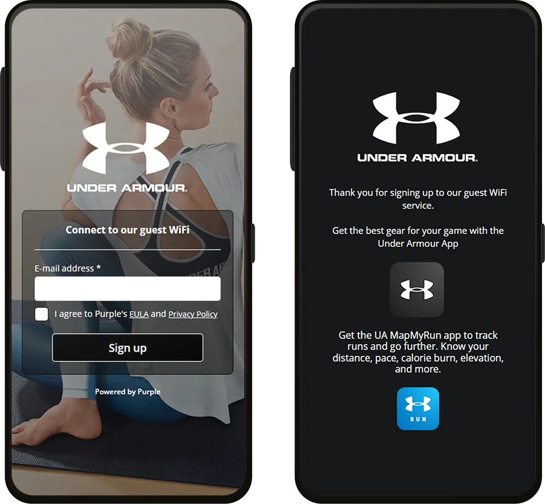
Connect

- Secure captive portal
- Branded splash pages
- 25 supported languages
- Network analytics
- Monitor speed and venue coverage
- Compliance with major data laws
Capture
- First-party data capture
- CRM integration
- Detailed WiFi analytics
- Behavioral insights
- Email address verification
- Access to our support team
Engage
- Customized access journeys
- Personalized communications
- Advanced WiFi analytics
- Full suite integrations
- Passpoint and profile authentication
- Fully managed service options


.svg)
We are continually looking for new ways to enhance the customer experience, and Purple has helped us do just that, with the added benefit of customer insight.

90%
reduction in the need for IT engineers to visit sites physically
4m
visits that resulted in a WiFi login at a restaurant per year
2.5m
unique Guest WiFi users captured in the CRM in the first two years


Power strategic decisions with Guest WiFi
Fuel your business with Guest WiFi solutions designed to benefit your bottom line. See what you stand to gain using our ROI calculator, or compare our plans and pricing in more detail.


Power up with Guest WiFi analytics
Maximize data-led decisions across your business with Guest WiFi that lets you do just that. Speak to an expert to get started.
