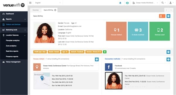
We’ll very shortly be releasing an updated version of our portal, so we wanted to give you a glimpse of what to expect.
Platform architecture rewrite with improved performance and access speeds
As a direct result of the massive Purple WiFi deployments we’ve seen across the globe, we’ve rewritten the fundamental building blocks of our system. We have also made core improvements to the most important areas of our platform in terms of future proofing, system scalability, end user access speed and overall performance and reliability.
Brand new look and feel
Based on what we’ve learnt, and the feedback we received, we’ve completely redesigned the look and feel of our portal. The interface is now more intuitive and the things you use the most are most easily accessible.
A brand new, clean and concise design.
CAM is now called ‘Visitors and devices’, and we’ve completely redesigned your profile cards.
Floorplan analytics has a brand new look and feel, with some great new features and significant speed improvements.
Navigation updates
All the things you are used to using are now even more accessible and user friendly.
Our navigation system now sits on the left hand side and you can drill down into each main area to access additional features. Other areas you are used to seeing have been updated and improved; venue switching and impersonation is now more intuitive, we’ve added a more detailed account area and included access to our user manual and support information.
Update user interface features
We’ve added some great new features to the user interface to make the portal experience even better.
We’ve added improvements to our user interface including overview reports at the top of each report page, an improved calendar date picker and a customer portal site wide search feature, to name but a few.
New reports
We’ve added new reports to our Presence and Visitor areas and included new report filter and setting options.
